seaborn.countplot
Bar graphs are useful for displaying relationships between categorical data and at least one numerical variable. seaborn.countplot is a barplot where the dependent variable is the number of instances of each instance of the independent variable.
dataset: IMDB 5000 Movie Dataset
%matplotlib inline
import pandas as pd
import matplotlib.pyplot as plt
import seaborn as sns
plt.rcParams['figure.figsize'] = (20.0, 10.0)
plt.rcParams['font.family'] = "serif"
df = pd.read_csv('../../../datasets/movie_metadata.csv')
df.head()
| color | director_name | num_critic_for_reviews | duration | director_facebook_likes | actor_3_facebook_likes | actor_2_name | actor_1_facebook_likes | gross | genres | ... | num_user_for_reviews | language | country | content_rating | budget | title_year | actor_2_facebook_likes | imdb_score | aspect_ratio | movie_facebook_likes | |
|---|---|---|---|---|---|---|---|---|---|---|---|---|---|---|---|---|---|---|---|---|---|
| 0 | Color | James Cameron | 723.0 | 178.0 | 0.0 | 855.0 | Joel David Moore | 1000.0 | 760505847.0 | Action|Adventure|Fantasy|Sci-Fi | ... | 3054.0 | English | USA | PG-13 | 237000000.0 | 2009.0 | 936.0 | 7.9 | 1.78 | 33000 |
| 1 | Color | Gore Verbinski | 302.0 | 169.0 | 563.0 | 1000.0 | Orlando Bloom | 40000.0 | 309404152.0 | Action|Adventure|Fantasy | ... | 1238.0 | English | USA | PG-13 | 300000000.0 | 2007.0 | 5000.0 | 7.1 | 2.35 | 0 |
| 2 | Color | Sam Mendes | 602.0 | 148.0 | 0.0 | 161.0 | Rory Kinnear | 11000.0 | 200074175.0 | Action|Adventure|Thriller | ... | 994.0 | English | UK | PG-13 | 245000000.0 | 2015.0 | 393.0 | 6.8 | 2.35 | 85000 |
| 3 | Color | Christopher Nolan | 813.0 | 164.0 | 22000.0 | 23000.0 | Christian Bale | 27000.0 | 448130642.0 | Action|Thriller | ... | 2701.0 | English | USA | PG-13 | 250000000.0 | 2012.0 | 23000.0 | 8.5 | 2.35 | 164000 |
| 4 | NaN | Doug Walker | NaN | NaN | 131.0 | NaN | Rob Walker | 131.0 | NaN | Documentary | ... | NaN | NaN | NaN | NaN | NaN | NaN | 12.0 | 7.1 | NaN | 0 |
5 rows × 28 columns
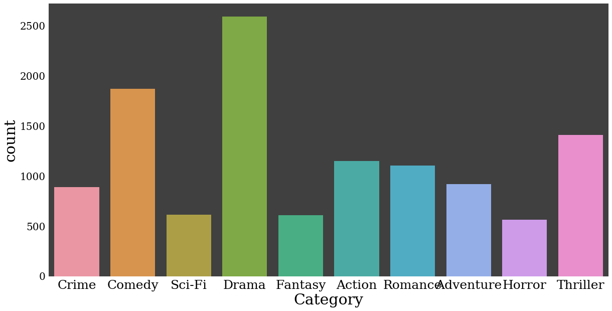
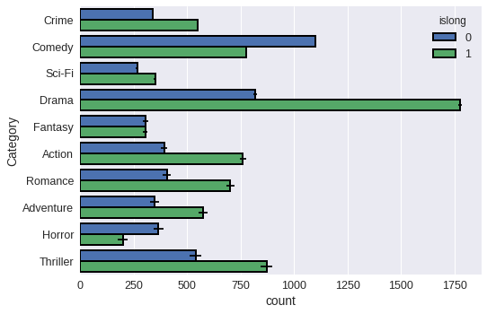
For the bar plot, let’s look at the number of movies in each category, allowing each movie to be counted more than once.
# split each movie's genre list, then form a set from the unwrapped list of all genres
categories = set([s for genre_list in df.genres.unique() for s in genre_list.split("|")])

# one-hot encode each movie's classification
for cat in categories:
    df[cat] = df.genres.transform(lambda s: int(cat in s))
# drop other columns
df = df[['director_name','genres','duration'] + list(categories)]
df.head()
| director_name | genres | duration | Crime | Comedy | Sci-Fi | War | Western | Biography | Reality-TV | ... | Sport | Film-Noir | Romance | Short | Family | Animation | Adventure | Mystery | Horror | Thriller | |
|---|---|---|---|---|---|---|---|---|---|---|---|---|---|---|---|---|---|---|---|---|---|
| 0 | James Cameron | Action|Adventure|Fantasy|Sci-Fi | 178.0 | 0 | 0 | 1 | 0 | 0 | 0 | 0 | ... | 0 | 0 | 0 | 0 | 0 | 0 | 1 | 0 | 0 | 0 |
| 1 | Gore Verbinski | Action|Adventure|Fantasy | 169.0 | 0 | 0 | 0 | 0 | 0 | 0 | 0 | ... | 0 | 0 | 0 | 0 | 0 | 0 | 1 | 0 | 0 | 0 |
| 2 | Sam Mendes | Action|Adventure|Thriller | 148.0 | 0 | 0 | 0 | 0 | 0 | 0 | 0 | ... | 0 | 0 | 0 | 0 | 0 | 0 | 1 | 0 | 0 | 1 |
| 3 | Christopher Nolan | Action|Thriller | 164.0 | 0 | 0 | 0 | 0 | 0 | 0 | 0 | ... | 0 | 0 | 0 | 0 | 0 | 0 | 0 | 0 | 0 | 1 |
| 4 | Doug Walker | Documentary | NaN | 0 | 0 | 0 | 0 | 0 | 0 | 0 | ... | 0 | 0 | 0 | 0 | 0 | 0 | 0 | 0 | 0 | 0 |
5 rows × 29 columns
# convert from wide to long format and remove null classificaitons
df = pd.melt(df,
             id_vars=['duration'],
             value_vars = list(categories),
             var_name = 'Category',
             value_name = 'Count')
df = df.loc[df.Count>0]
top_categories = df.groupby('Category').aggregate(sum).sort_values('Count', ascending=False).index
howmany=10
# add an indicator whether a movie is short or long, split at 100 minutes runtime
df['islong'] = df.duration.transform(lambda x: int(x > 100))
df = df.loc[df.Category.isin(top_categories[:howmany])]
# sort in descending order
#df = df.loc[df.groupby('Category').transform(sum).sort_values('Count', ascending=False).index]
df.head()
| duration | Category | Count | islong | |
|---|---|---|---|---|
| 45 | 140.0 | Crime | 1 | 1 |
| 59 | 91.0 | Crime | 1 | 0 |
| 66 | 152.0 | Crime | 1 | 1 |
| 100 | 106.0 | Crime | 1 | 1 |
| 157 | 90.0 | Crime | 1 | 0 |
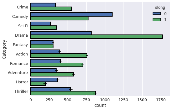
Basic plot
p = sns.countplot(data=df, x = 'Category')
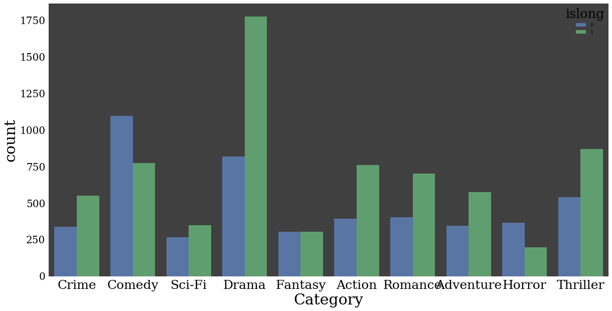
color by a category
p = sns.countplot(data=df,
                  x = 'Category',
                  hue = 'islong')
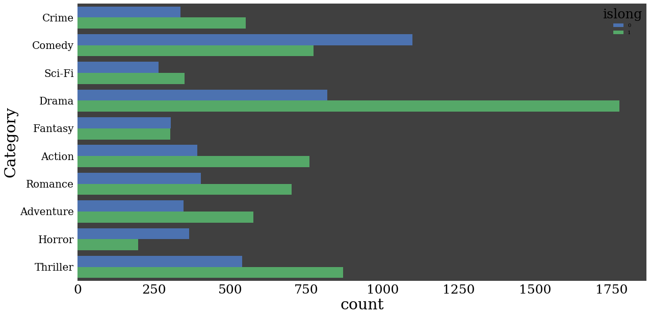
make plot horizontal
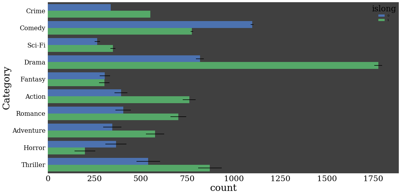
p = sns.countplot(data=df,
                  y = 'Category',
                  hue = 'islong')

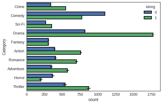
Saturation
p = sns.countplot(data=df,
                  y = 'Category',
                  hue = 'islong',
                  saturation=1)
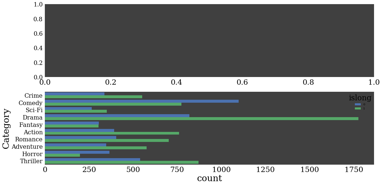
Targeting a non-default axes
import matplotlib.pyplot as plt
fig, ax = plt.subplots(2)
sns.countplot(data=df,
                  y = 'Category',
                  hue = 'islong',
                  saturation=1,
                  ax=ax[1])
<matplotlib.axes._subplots.AxesSubplot at 0x7f5609f2d860>
Add error bars
import numpy as np
num_categories = df.Category.unique().size
p = sns.countplot(data=df,
                  y = 'Category',
                  hue = 'islong',
                  saturation=1,
                  xerr=7*np.arange(num_categories))
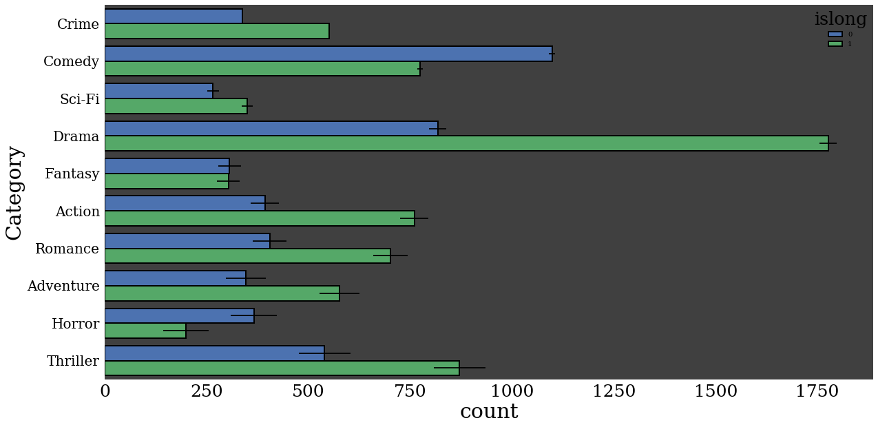
add black bounding lines
import numpy as np
num_categories = df.Category.unique().size
p = sns.countplot(data=df,
                  y = 'Category',
                  hue = 'islong',
                  saturation=1,
                  xerr=7*np.arange(num_categories),
                  edgecolor=(0,0,0),
                  linewidth=2)
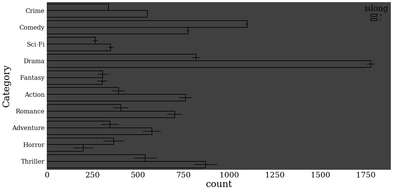
Remove color fill
import numpy as np
num_categories = df.Category.unique().size
p = sns.countplot(data=df,
                  y = 'Category',
                  hue = 'islong',
                  saturation=1,
                  xerr=7*np.arange(num_categories),
                  edgecolor=(0,0,0),
                  linewidth=2,
                  fill=False)
import numpy as np
num_categories = df.Category.unique().size
p = sns.countplot(data=df,
                  y = 'Category',
                  hue = 'islong',
                  saturation=1,
                  xerr=7*np.arange(num_categories),
                  edgecolor=(0,0,0),
                  linewidth=2)

sns.set(font_scale=1.25)
num_categories = df.Category.unique().size
p = sns.countplot(data=df,
                  y = 'Category',
                  hue = 'islong',
                  saturation=1,
                  xerr=3*np.arange(num_categories),
                  edgecolor=(0,0,0),
                  linewidth=2)
help(sns.set)
Help on function set in module seaborn.rcmod:

set(context='notebook', style='darkgrid', palette='deep', font='sans-serif', font_scale=1, color_codes=False, rc=None)
    Set aesthetic parameters in one step.

    Each set of parameters can be set directly or temporarily, see the
    referenced functions below for more information.

    Parameters
    ----------
    context : string or dict
        Plotting context parameters, see :func:`plotting_context`
    style : string or dict
        Axes style parameters, see :func:`axes_style`
    palette : string or sequence
        Color palette, see :func:`color_palette`
    font : string
        Font family, see matplotlib font manager.
    font_scale : float, optional
        Separate scaling factor to independently scale the size of the
        font elements.
    color_codes : bool
        If ``True`` and ``palette`` is a seaborn palette, remap the shorthand
        color codes (e.g. "b", "g", "r", etc.) to the colors from this palette.
    rc : dict or None
        Dictionary of rc parameter mappings to override the above.
plt.rcParams['font.family'] = "cursive"
#sns.set(style="white",font_scale=1.25)
num_categories = df.Category.unique().size
p = sns.countplot(data=df,
                  y = 'Category',
                  hue = 'islong',
                  saturation=1,
                  xerr=3*np.arange(num_categories),
                  edgecolor=(0,0,0),
                  linewidth=2)
/usr/local/lib/python3.5/dist-packages/matplotlib/font_manager.py:1297: UserWarning: findfont: Font family ['cursive'] not found. Falling back to DejaVu Sans
  (prop.get_family(), self.defaultFamily[fontext]))
plt.rcParams['font.family'] = 'Times New Roman'
#sns.set_style({'font.family': 'Helvetica'})
sns.set(style="white",font_scale=1.25)
num_categories = df.Category.unique().size
p = sns.countplot(data=df,
                  y = 'Category',
                  hue = 'islong',
                  saturation=1,
                  xerr=3*np.arange(num_categories),
                  edgecolor=(0,0,0),
                  linewidth=2)
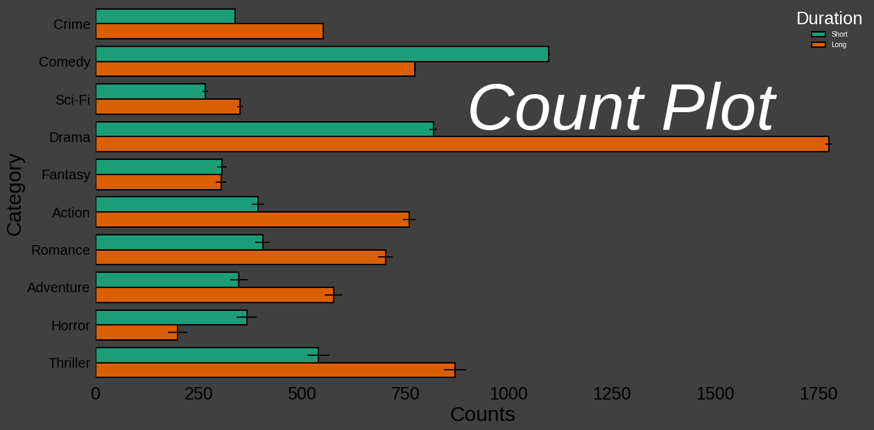
bg_color = (0.25, 0.25, 0.25)
sns.set(rc={"font.style":"normal",
            "axes.facecolor":bg_color,
            "figure.facecolor":bg_color,
            "text.color":"black",
            "xtick.color":"black",
            "ytick.color":"black",
            "axes.labelcolor":"black",
            "axes.grid":False,
            'axes.labelsize':30,
            'figure.figsize':(20.0, 10.0),
            'xtick.labelsize':25,
            'ytick.labelsize':20})

#sns.set_style({'font.family': 'Helvetica'})
#sns.set(style="white",font_scale=1.25)
num_categories = df.Category.unique().size
p = sns.countplot(data=df,
                  y = 'Category',
                  hue = 'islong',
                  saturation=1,
                  xerr=3*np.arange(num_categories),
                  edgecolor=(0,0,0),
                  linewidth=2,
                  palette="Dark2")
leg = p.get_legend()
leg.set_title("Duration")
labs = leg.texts
labs[0].set_text("Short")
labs[1].set_text("Long")
leg.get_title().set_color('white')
for lab in labs:
    lab.set_color('white')
p.axes.xaxis.label.set_text("Counts")
plt.text(900,2.8, "Count Plot", fontsize = 95, color='white', fontstyle='italic')
<matplotlib.text.Text at 0x7f5609d0ac18>
p.get_figure().savefig('../../figures/countplot.png')