seaborn.violinplot
Violinplots summarize numeric data over a set of categories. They are essentially a box plot with a kernel density estimate (KDE) overlaid along the range of the box and reflected to make it look nice. They provide more information than a boxplot because they also include information about how the data is distributed within the inner quartiles. dataset: IMDB 5000 Movie Dataset
%matplotlib inline
import pandas as pd
import matplotlib.pyplot as plt
import seaborn as sns
import numpy as np
plt.rcParams['figure.figsize'] = (20.0, 10.0)
plt.rcParams['font.family'] = "serif"
df = pd.read_csv('../../../datasets/movie_metadata.csv')
df.head()
| color | director_name | num_critic_for_reviews | duration | director_facebook_likes | actor_3_facebook_likes | actor_2_name | actor_1_facebook_likes | gross | genres | ... | num_user_for_reviews | language | country | content_rating | budget | title_year | actor_2_facebook_likes | imdb_score | aspect_ratio | movie_facebook_likes | |
|---|---|---|---|---|---|---|---|---|---|---|---|---|---|---|---|---|---|---|---|---|---|
| 0 | Color | James Cameron | 723.0 | 178.0 | 0.0 | 855.0 | Joel David Moore | 1000.0 | 760505847.0 | Action|Adventure|Fantasy|Sci-Fi | ... | 3054.0 | English | USA | PG-13 | 237000000.0 | 2009.0 | 936.0 | 7.9 | 1.78 | 33000 |
| 1 | Color | Gore Verbinski | 302.0 | 169.0 | 563.0 | 1000.0 | Orlando Bloom | 40000.0 | 309404152.0 | Action|Adventure|Fantasy | ... | 1238.0 | English | USA | PG-13 | 300000000.0 | 2007.0 | 5000.0 | 7.1 | 2.35 | 0 |
| 2 | Color | Sam Mendes | 602.0 | 148.0 | 0.0 | 161.0 | Rory Kinnear | 11000.0 | 200074175.0 | Action|Adventure|Thriller | ... | 994.0 | English | UK | PG-13 | 245000000.0 | 2015.0 | 393.0 | 6.8 | 2.35 | 85000 |
| 3 | Color | Christopher Nolan | 813.0 | 164.0 | 22000.0 | 23000.0 | Christian Bale | 27000.0 | 448130642.0 | Action|Thriller | ... | 2701.0 | English | USA | PG-13 | 250000000.0 | 2012.0 | 23000.0 | 8.5 | 2.35 | 164000 |
| 4 | NaN | Doug Walker | NaN | NaN | 131.0 | NaN | Rob Walker | 131.0 | NaN | Documentary | ... | NaN | NaN | NaN | NaN | NaN | NaN | 12.0 | 7.1 | NaN | 0 |
5 rows × 28 columns
For the bar plot, let’s look at the number of movies in each category, allowing each movie to be counted more than once.
# split each movie's genre list, then form a set from the unwrapped list of all genres
categories = set([s for genre_list in df.genres.unique() for s in genre_list.split("|")])

# one-hot encode each movie's classification
for cat in categories:
    df[cat] = df.genres.transform(lambda s: int(cat in s))
# drop other columns
df = df[['director_name','genres','duration'] + list(categories)]
df.head()
| director_name | genres | duration | Fantasy | War | Family | Mystery | Sport | History | Comedy | ... | Sci-Fi | Action | Thriller | Horror | Crime | Biography | News | Music | Western | Game-Show | |
|---|---|---|---|---|---|---|---|---|---|---|---|---|---|---|---|---|---|---|---|---|---|
| 0 | James Cameron | Action|Adventure|Fantasy|Sci-Fi | 178.0 | 1 | 0 | 0 | 0 | 0 | 0 | 0 | ... | 1 | 1 | 0 | 0 | 0 | 0 | 0 | 0 | 0 | 0 |
| 1 | Gore Verbinski | Action|Adventure|Fantasy | 169.0 | 1 | 0 | 0 | 0 | 0 | 0 | 0 | ... | 0 | 1 | 0 | 0 | 0 | 0 | 0 | 0 | 0 | 0 |
| 2 | Sam Mendes | Action|Adventure|Thriller | 148.0 | 0 | 0 | 0 | 0 | 0 | 0 | 0 | ... | 0 | 1 | 1 | 0 | 0 | 0 | 0 | 0 | 0 | 0 |
| 3 | Christopher Nolan | Action|Thriller | 164.0 | 0 | 0 | 0 | 0 | 0 | 0 | 0 | ... | 0 | 1 | 1 | 0 | 0 | 0 | 0 | 0 | 0 | 0 |
| 4 | Doug Walker | Documentary | NaN | 0 | 0 | 0 | 0 | 0 | 0 | 0 | ... | 0 | 0 | 0 | 0 | 0 | 0 | 0 | 0 | 0 | 0 |
5 rows × 29 columns
# convert from wide to long format and remove null classificaitons
df = pd.melt(df,
             id_vars=['duration'],
             value_vars = list(categories),
             var_name = 'Category',
             value_name = 'Count')
df = df.loc[df.Count>0]
top_categories = df.groupby('Category').aggregate(sum).sort_values('Count', ascending=False).index
howmany=10
df = df.loc[df.Category.isin(top_categories[:howmany])]
df.rename(columns={"duration":"Duration"},inplace=True)
df.head()
| Duration | Category | Count | |
|---|---|---|---|
| 0 | 178.0 | Fantasy | 1 |
| 1 | 169.0 | Fantasy | 1 |
| 7 | 100.0 | Fantasy | 1 |
| 9 | 153.0 | Fantasy | 1 |
| 13 | 151.0 | Fantasy | 1 |
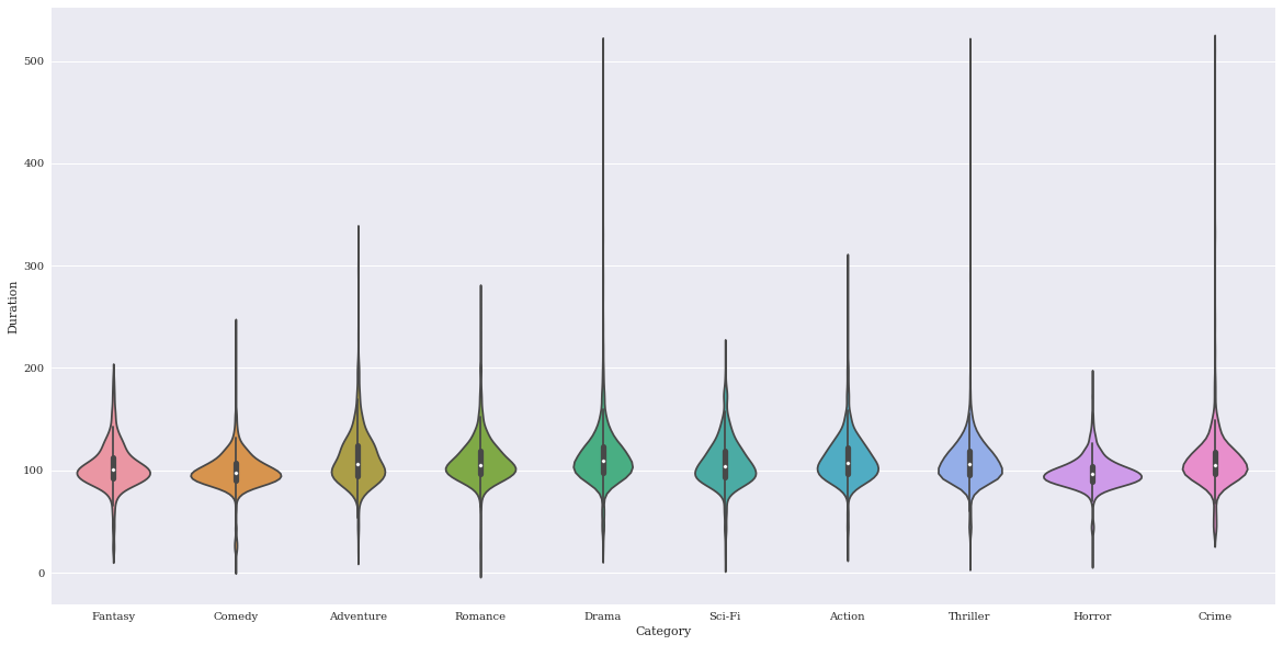
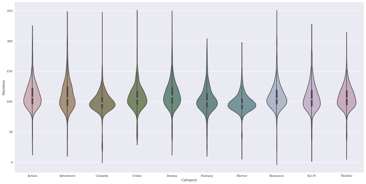
Basic plot
p = sns.violinplot(data=df,
                   x = 'Category',
                   y = 'Duration')
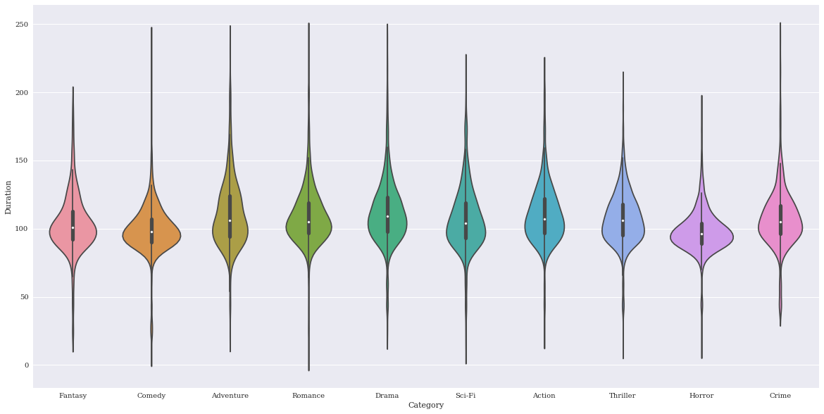
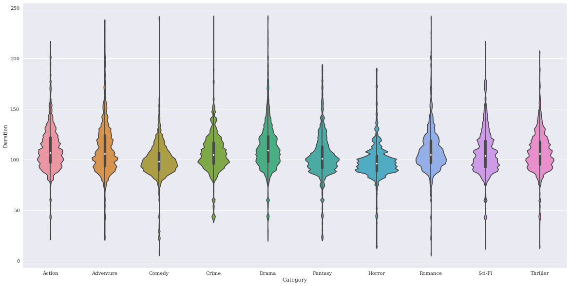
The outliers here are making things a bit squished, so I’ll remove them since I am just interested in demonstrating the visualization tool.
df = df.loc[df.Duration < 250]
p = sns.violinplot(data=df,
                   x = 'Category',
                   y = 'Duration')
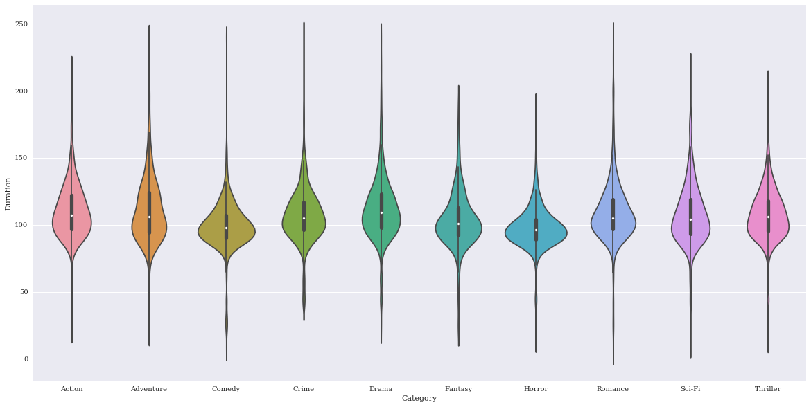
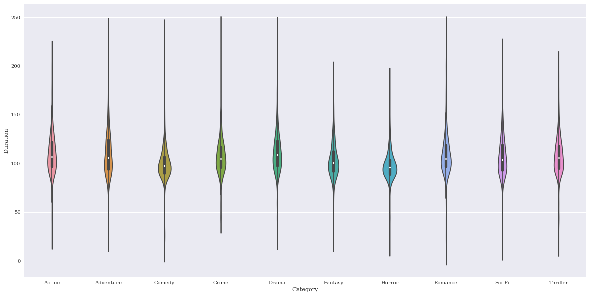
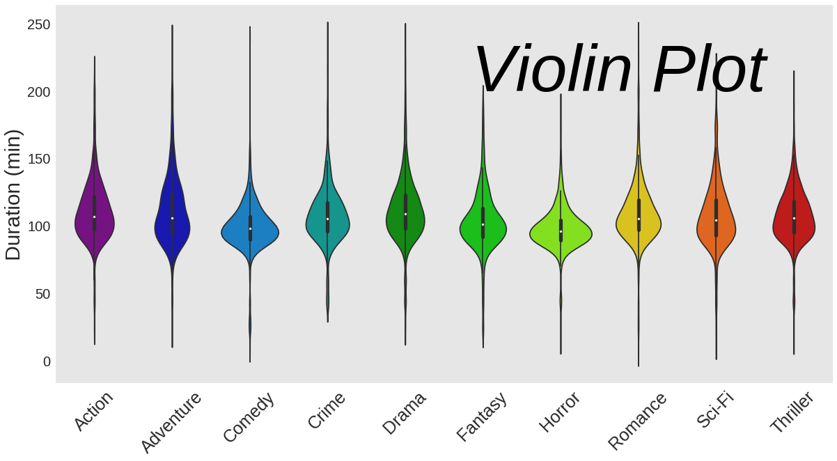
Change the order of categories
p = sns.violinplot(data=df,
                   x = 'Category',
                   y = 'Duration',
                   order = sorted(df.Category.unique()))
Change the order that the colors are chosen
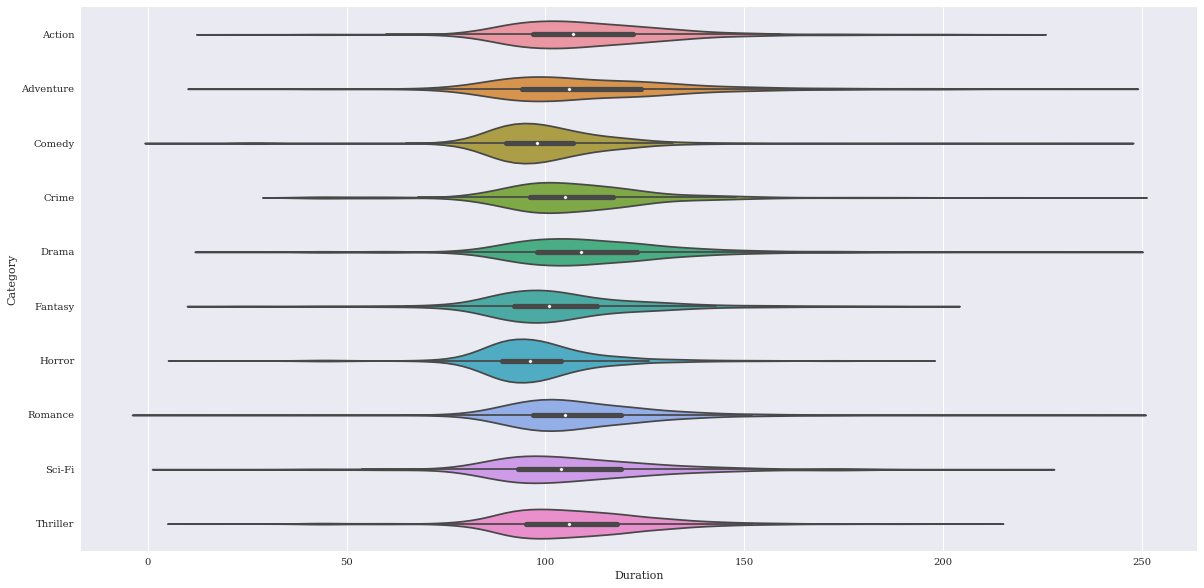
Change orientation to horizontal
p = sns.violinplot(data=df,
                   y = 'Category',
                   x = 'Duration',
                   order = sorted(df.Category.unique()),
                   orient="h")
Desaturate
p = sns.violinplot(data=df,
                   x = 'Category',
                   y = 'Duration',
                   order = sorted(df.Category.unique()),
                   saturation=.25)
Adjust width of violins
p = sns.violinplot(data=df,
                   x = 'Category',
                   y = 'Duration',
                   order = sorted(df.Category.unique()),
                   width=.25)
Change the size of outlier markers
p = sns.violinplot(data=df,
                   x = 'Category',
                   y = 'Duration',
                   order = sorted(df.Category.unique()),
                   fliersize=20)

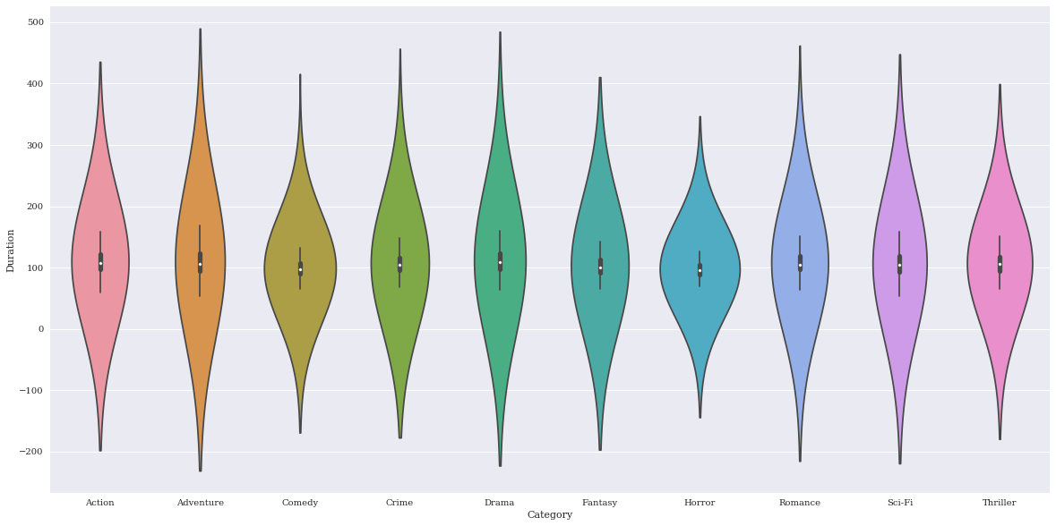
Adjust the bandwidth of the KDE filtering parameter. Smaller values will use a thinner kernel and thus will contain higher feature resolution but potentially noise. Here are examples of low and high settings to demonstrate the difference.
p = sns.violinplot(data=df,
                   x = 'Category',
                   y = 'Duration',
                   order = sorted(df.Category.unique()),
                   bw=.05)
p = sns.violinplot(data=df,
                   x = 'Category',
                   y = 'Duration',
                   order = sorted(df.Category.unique()),
                   bw=5)
Finalize
sns.set(rc={"axes.facecolor":"#e6e6e6",
            "axes.grid":False,
            'axes.labelsize':30,
            'figure.figsize':(20.0, 10.0),
            'xtick.labelsize':25,
            'ytick.labelsize':20})


p = sns.violinplot(data=df,
                   x = 'Category',
                   y = 'Duration',
                   palette = 'spectral',
                   order = sorted(df.Category.unique()),
                   notch=True)
plt.xticks(rotation=45)
l = plt.xlabel('')
plt.ylabel('Duration (min)')
plt.text(4.85,200, "Violin Plot", fontsize = 95, color="black", fontstyle='italic')
<matplotlib.text.Text at 0x7f9c6e707e48>
p.get_figure().savefig('../../figures/violinplot.png')